Pressed Flower Illustration – Art Process – written for and featured in Mom’s Favorite Reads March 2022 edition.
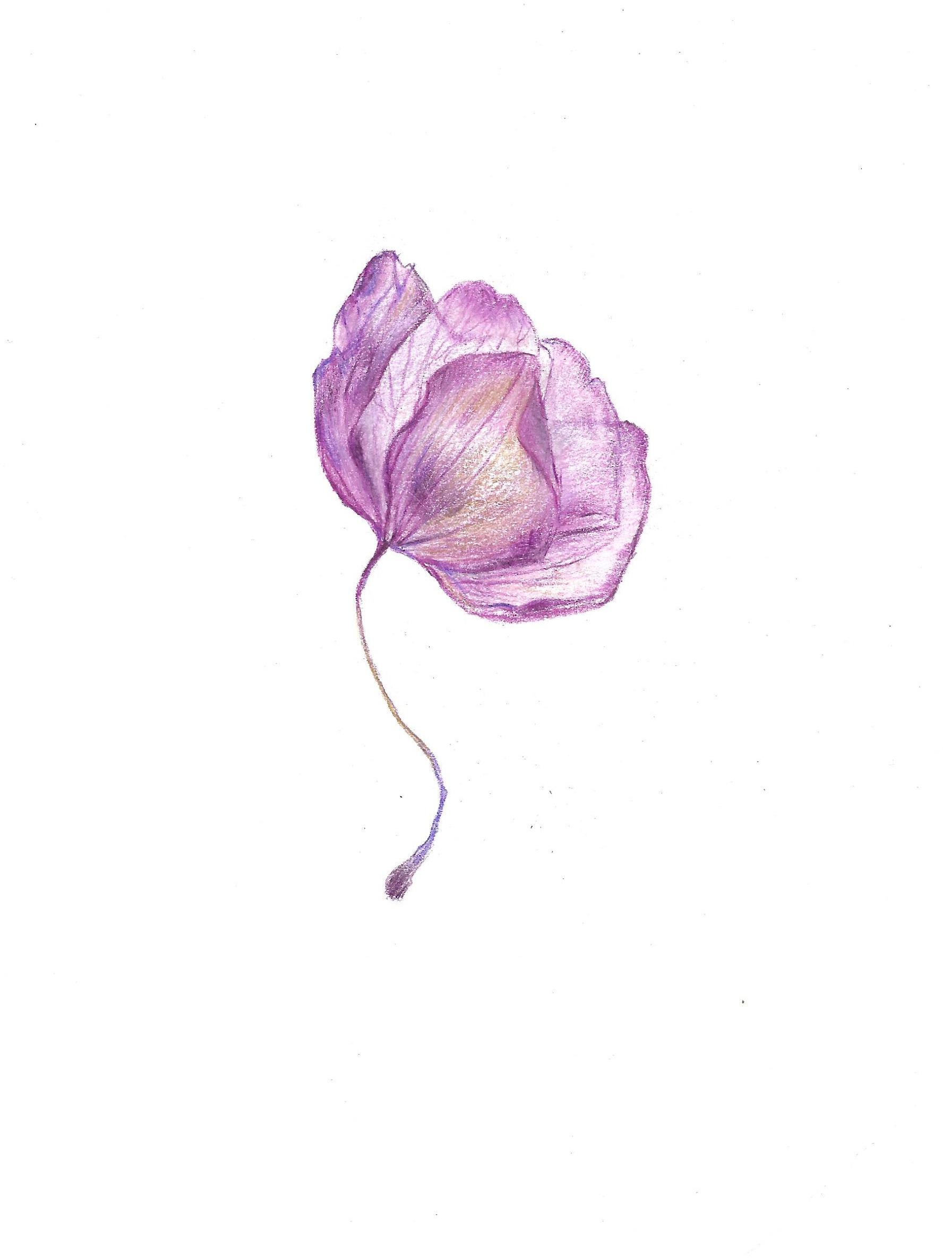
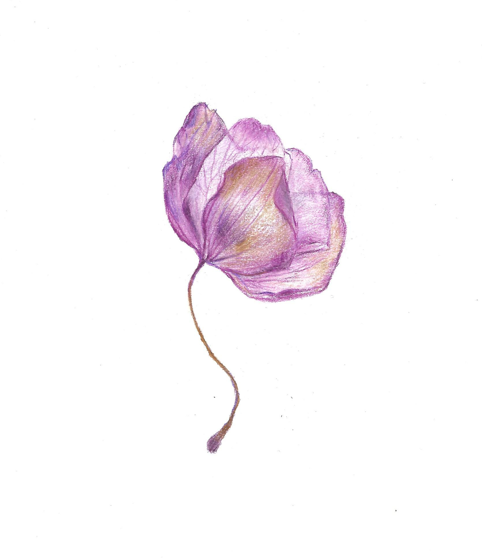
Orchid in coloured pencil.
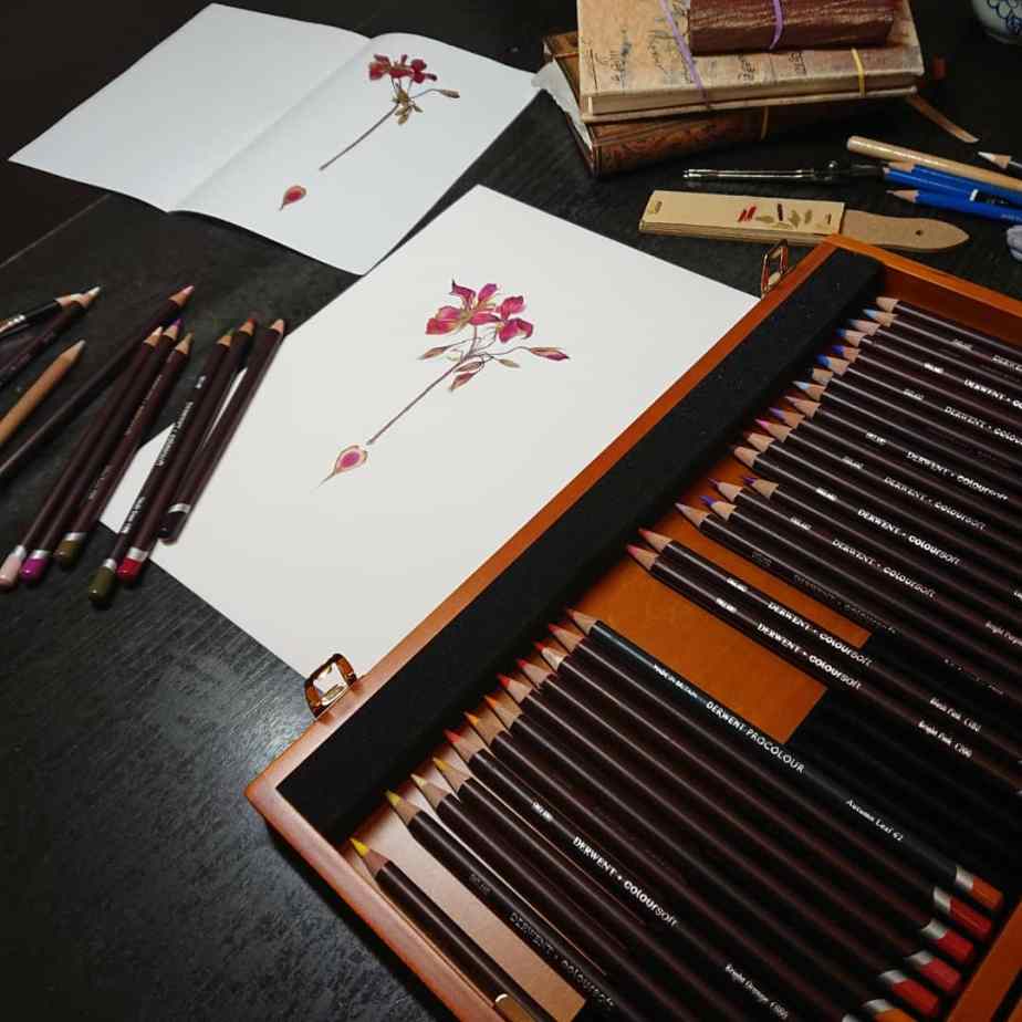

I like to press any flowers I get my hands on so I can come back years later and draw them. I’ve been doing that for over ten years now and have lots of cute flowers, leaves and grass in splat form. They live (and are mostly pressed) in a few pretty books that I also enjoy collecting.
I like to draw pressed flowers because they look so interesting, and I like the way the colours change when they are pressed. Sometimes they are more muted and aged and sometimes the bright colours seem more vivid – perhaps because the other colours have paled; but the thing I really like about the pressed flower is that it’s still here; preserved.
This flower is an orchid which I pressed between the pages of a book about five years ago – I think it would be nothing but dust if I hadn’t intervened, and that sort of makes me happy.
In the tradition of continuing with this flower preservation, I like to draw them, too.
Using a paper towel under my wrist and fingers to keep the paper clean, I started off making a line drawing with a grey lavender wax based coloured pencil – used lightly, so that any mistakes can be removed more easily. Coloured pencils are a bit more stubborn to rub out compared to the usual graphite that I use for lines, but the graphite will not work that well with coloured pencil, so I choose to avoid it.
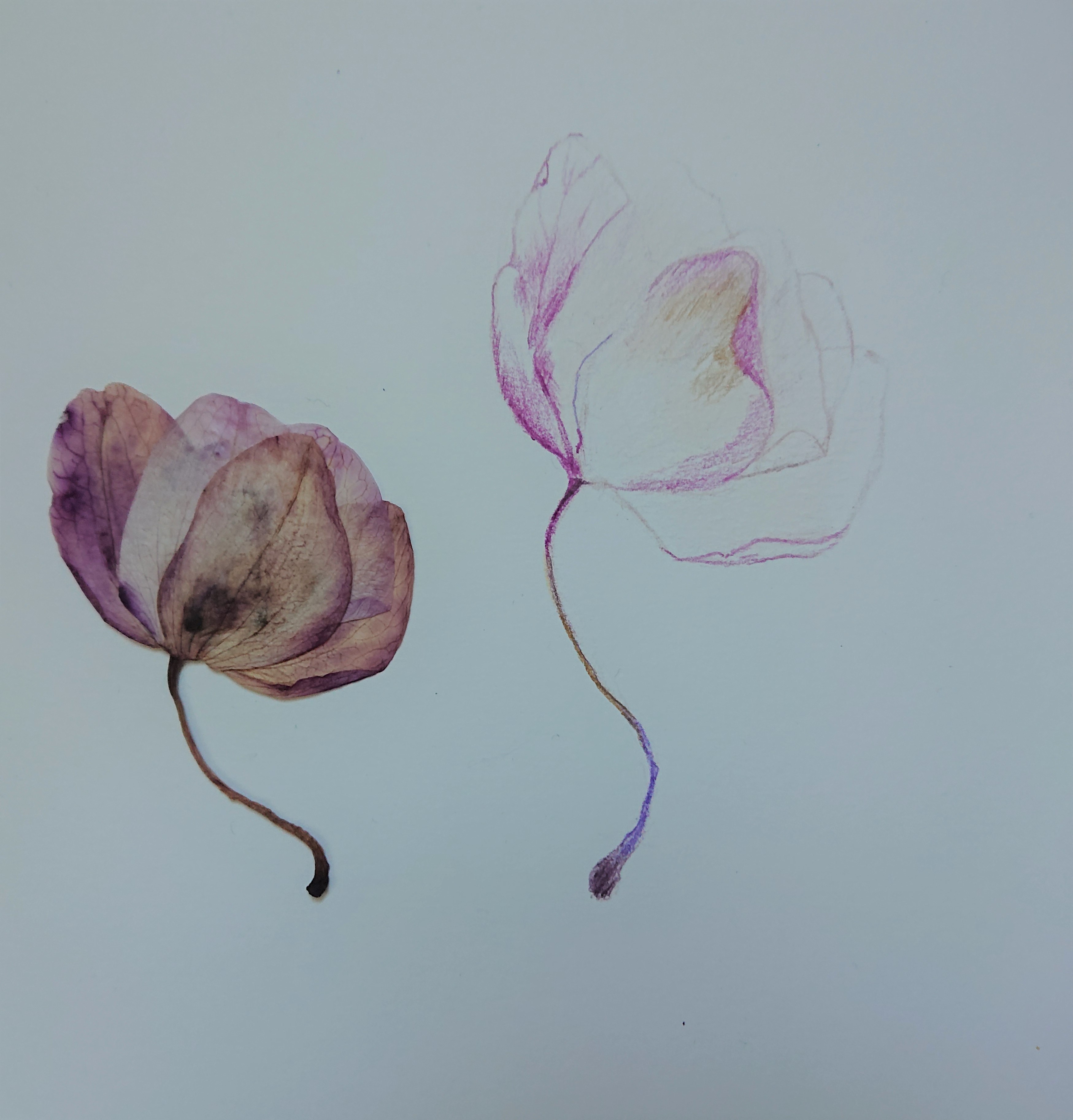

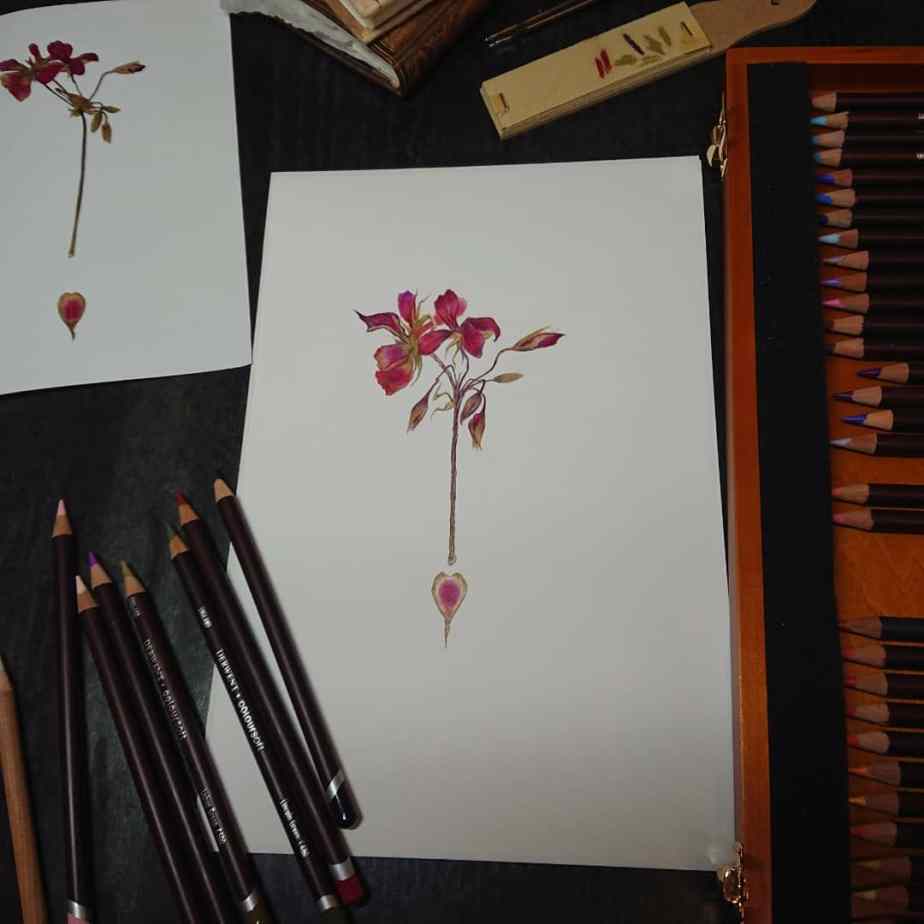
Once I’m happy with the line art (and it really doesn’t have to be exact) I start adding layers of colour – paler shades which will add to the layers of colour and give the petals more vibrancy and keep light areas light. If there’s one thing I’ve carried over from my disastrous watercolour attempts it’s that preserving the white of your paper is really important.
Some of the colours I used here are soft pink and lavender, as well as blue based purples and blackberry. I look at the colours to work out which ones are dominant, which ones are there for contrast and which ones are surprising (like the brown of the stalk turning purple as it moves up towards the flower, and then reappearing once more, browning the petals to show their gorgeous aging).
I leave hard edges for the petals edge and softer strokes for transitions where the colours meet and marry. I add colour in the direction of the texture of the petal.
I use a colour free wax blender (because my pencils are wax based) to blend, and I burnish with a white or a lighter colour to mute or lighten. If the colour starts looking too bright you can mute it with grey – I used grey lavender and pale lavender to tone down this problem.
If you need to remove some colour or add some texture and a regular putty eraser won’t do it then stickier blu tack/poster putty will be helpful. It won’t stay sticky forever, but it is very handy for working on mistakes and tidying up as you go along.
I wanted to strengthen the outer edges of the petal at this point, but I don’t draw over the original line. Instead, I start adding the colour directly next to the line (from the inside) and pulling the colour into the petal – it looks more natural and helps form the colour gradation. I don’t want the petal to look too solid since its flat and squished from pressing these days, so I try really hard to draw what I can see and not what I think it should look like. I also don’t want to lose the translucency of the petals, so I am trying to resist too much blending, so that the white of the paper can play its part.
My final step is to add some additional greys and some browns to the petals to give it an aged, antique feel, and I’m done!
—
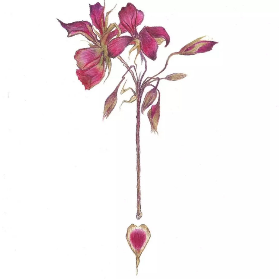
I went on to make this drawing a part of my floral collection greeting cards. 🙂


www.etsy.com/uk/shop/PaynesGreyArtShop
