Frankenstein – Belligerent Bride


Illustrations by Alison Baker Rasmussen
Day 1: Spooky Self Portrait
This is me. Honest.


I can’t make any drawing this time as I have issues with my right eye ☹ but I’ve been adapting, and working on my gothic junk journals with older Drawlloweens.
Happy October everyone!
Oh, so long ago a lovely collection of seeding dandelions were collected and collated into a collage. The perfect store for my Seed Fairy’s fashion inspirations. She wears fluffing dandelions in her hair, a pretty petalled gown and dusty moth wings. She is ready for the fairy ball. Or so you’d like to think. But no, she is the worlds biggest trickster as she loves to hide out of sight and have seeds rain down on any unsuspecting fairy she takes a shine to.
You’ll meet that fairy next time.
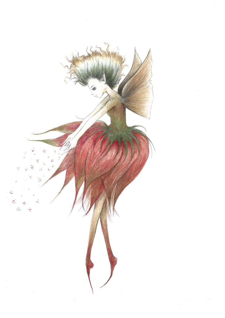
I drew her using aged flowers that had been collected and displayed in a picture frame. The dried fluff on a dandelion is perfect and I began with graphite with the idea that I would finish with coloured pencil. I love to draw in graphite, but I know colour would enhance a lovely fairy, so I decided to make my graphite work as an under drawing and then I can add colour later. Grey scale underpaintings are a useful step towards your finished piece as you can solve quite a lot of problems at an early stage. I always find this part relaxing. I think giving yourself freedom to make mistakes is very important to enjoying the process – art shouldn’t be stressful. I find painting stressful as I’m not a painter and this is my answer. And once the graphite drawing is ready, I plan to scan a slightly paler version of it and print it on the same good quality paper so I can then continue safely adding colour to the drawing. Colour pencil directly over graphite is not a good idea – it looks dirty and you can ruin quite a lot of effort that way.
Going back to the initial graphite I used a few mark making techniques that I find work quite well with graphite pencils. You can get them reliably sharp and work at different angles and pressure to get some interesting effects.
The frothy hair was made with twists and flicks, the smooth skin was made by transferring graphite from the pencil via the paper to the tornichon – I find this so much smoother than lines – especially for such a small face.
As I refined the sketch, I noticed that the proportions needed a little attention, her neck was a little too big and her jaw too manly, so I slimmed that down and sharpened her jaw – something I would have struggled with had I dived straight in with coloured pencil. I continued this way until I was satisfied that she was believable. This particular fairy is based on human anatomy and so I used a selection of references that helped me check that she was correct. I find manga and anime art is very helpful with this sort of project because it is very dynamic.
I continued working on her skirt – which is an inverted flower, and I made plump petals to give it a bell shape. I gave it movement by pushing them forward to show she was flying, and they were interreacting with her lower body. Her legs were loosely based on flower stems.
Since I have other plans, there is no point trying to finish this as a very detailed graphite drawing, so I scanned it, and printed it on to the same paper I used for the first stage. I added some pale layers of browns and reds and greens. Too many colours are likely to spoil the drawing and I like to use Autumnal colours for this type of creature so I am keeping it simple. I think a mix of different browns can look so lovely, and I’m pretty sure this is why I get so much inspiration from Froud and Rackham as their work features these colours a lot. I like working with muted tones. They seem more delicate to me. More subtle. They are not as simple as they look, but it’s nice that they give that impression.
There is still a lot of work to do at this stage. Make no mistake, it is not colouring in. The graphite is an underpainting and I’ll probably be here a while!
I’m using subdued colours for this fairy. Medium terracotta, Lincoln green, and a mix of browns. Understanding the colours will be helpful. Greens and reds are complimentary colours so tend to make each other appear brighter if they are next to each other. You can also use a red to mute a green – or vice versa – if your colour looks too bright. Mixing them creates different browns depending on the type of red and green you choose. I think this can make colours marry nicely as your parent colours will work without too much trouble with the brown you made them with.
I am currently collecting wild flowers (some people call them weeds, I suppose) as I go on my walks, and when I get home I press them between pages for future art making. So, this week I have been inspired to create my folksy board to celebrate the latest flowery members of my pressed flower family 🙂
So, this weeks Folksy Board theme is flowers – and it includes the orchid I illustrated for a recent magazine article. (I wrote about that here)

Pencil illustration – Inspired by pressed flowers.
I have some cards and postcard/art cards available, and I have also listed the original of the red flower and orchid/buttercup drawings available in my Folksy shop.
Happy Folksy Friday!
Alison
It’s been a month of ladybird creations for me as not only have I made some ladybird art for the Animaloon Collective over on Twitter, I also submitted another illustration and a story to the magazine I contribute to. This will be for the May 2022 edition so I will share soon enough.
For now here’s the artwork I made for the loony balloony balloon fest that occurs every second Tuesday of the month. As usual, I am loathe to inflate them. Instead they become airborne in all manner of whimsical ways. This time it’s steam!

This was inspired by ladybirds, steampunk dirigibles, and my work in progress ghost story.
Drawn with graphite and coloured pencils.

Fluffy Cat in Graphite – Art Process
by Alison Rasmussen


I think mark making is a great way to build texture with graphite and I really love drawing fluffy things. I also yearn for a kitty cat but for various reasons I don’t have one, so it’s best to make one to fill that kitty cat void. This one looks very sympathetic and very fluffy!
Some time ago I drew a very silly cat called Slinky, shaped liked a skittle/bowling pin and very lanky, and I thought, since it’s kind of chilly, maybe she needed more hair.
I’m using some new pencils for the first time – Mars Lumograph Black – I like Mars Lumograph a lot, so I decided to test out the Black ones. They are similar to the others, just not as shiny as far as I can tell. My other tools include mechanical pencils, paper tornichons, and different erasers – a putty eraser, blue-tac, and a pencil eraser, which is, I guess, like a stick eraser in pencil form (must get me one on those!)
I don’t use the mechanical pencils for the mark making – there’s only so much you can do with a mechanical pencil as the lead can’t take the pressure, but they are good for laying out the initial line work, as I don’t need to worry about making errors and having to sharpen the wooden pencils into stubs before I’m even finished!
The paper I’m using is a lovely bright white – Canson extra white drawing paper 120 g/m2 – but to be honest just use whatever you like – I just like it very white! I have ordered white paper in the past that wasn’t remotely white and left me feeling rather bitter, so to actually find some that is bright and very white, well, I just feel I should mention it! 😊
I started out by working on the basic shape of the cat. I made her neck a little wider to take into account the fluff I‘m planning, and then started with the Black pencils. I added small lines and dashes very lightly, following the natural flow of the fur and the underlying structure of the cat’s body to make it believable. Even if she is a fantasy cat, she still needs to be believable. I drew the tail across her body – even though I plan to have it sit behind, this way the ends will meet, and make sense visually.


I blended my marks with the tornichon where the areas are small on her face and used a piece of cotton wool for the body. Then I kept working on another layer of marks, adding flicks of graphite along the contours to explain the changes in direction of the bones and muscles that sit beneath. I also used this to show the interaction with the cat’s environment i.e., the fur resting on the floor, flattened, or pushed up and out.
I changed to a heavier grade pencil, a 4B (then a 6B) so I could build on top of existing marks, and I added white flicks of exposed paper with the sharpened pencil eraser and the moulded to a point putty rubber. Keep the points of the erasers clean so they don’t add any unwanted smudges. Constantly sharpening the pencil eraser is a waste so you can use fine sandpaper to clean it off from time to time.
I also blended the sides of the cat to give her a blurred edge which would hopefully suggest a fuzzy fluffy fur effect. Continuing with the tornichon, I blended the marks I’d already made on the tail. I focussed on a line that ran down the centre of the length to suggest density where the bones would be and gave a lighter feel where only hair makes up the shape.
I started adding darker layers with a 6B to add a bit of depth. I realised at some point she had begun to look a little fluffier than I had intended. I’d lost sight of the skeleton and muscle, so I took steps to lift off some of the graphite with the putty rubber and the pencil eraser. Pushing the pencil with upwards strokes, as if working underneath the fur, creates some important shading as it creates a denser appearance. I did this with the darker 6B but I didn’t go overboard as too much uniformity with the mark making spoils the effect.
I finished with an 8B to add definition and find any lost details and sharpen up any important lines. And now Slinky is all set for a cold Spring!
I’ve focussed on the fur texture here and so I haven’t mentioned the eyes, but I plan to write about drawing eyes another time.
Oh! I’ve included some of the other floofs I made. They insisted! 😊


Featured in Mom’s favorite Reads Magazine
It’s Folksy Friday and this week I made a Mythical Creatures board to showcase some of the things I have made.

I worked with mixed media as well as some very mixed inspiration!
I’m always inspired by fairy tales and folklore, and Asian art.
There’s an anime influence with the Amaimon mermaid (Blue Exorcist) and the Blue Golem (Laputa – Castle in the Sky – Studio Ghibli).
Some of these were made with acrylic or watercolour paint (I hate painting!), some with graphite and some with coloured pencils (I love drawing!).
I have cards, postcards (for notes or art cards) and some prints available.
Happy Folksy Friday!
Alison
Hello! I’ve been busy setting up listings in my Folksy shop – Paynes Grey Art Shop.
I made my first Folksy Friday grid – the theme – Gothic!

My illustrations were made for Halloween and Drawlloween 2020/2021, and for a ghost story I am (always) writing.
You can find me on Folksy. There you will find ghosts, and witches, gothic puppets, and vampires, and pressed flower art.
All inspired by my love of Halloween, Asian art, and cute witches.
I drew these using pastels and pastel pencils and have cards, postcards and prints available.
Happy Folksy Friday!
Alison
For Valentines
This is a drawing in progress, and I’ve begun picking out all the flowers I’m planning to use so maybe it will give an idea on where I am going with this one. I am so happy to be revisiting this drawing – they are two characters from my story about some ghosts and they are really great friends. I have bigger plans for them but at this point they are either too bashful to say much (Fileas Grey) or too jaded (Immi – aka the Bitter Immortal).


Some of the cards in my shops – inspired by my pressed flower collection, Valentines, and the forlornly hopeful arrival of Spring


I have lots planned for my blog this year – including sticking to a regular schedule and writing about the many things that interest me, such as anime, Asian art and drawing. Considering how much I am working on I am disappointed in myself that I never talk about it; my blog really should be a lot busier to show that!
I’ve decided to illustrate a series of Whimsical Witches for different seasons. I always thought vintage clothing to be ever so charming, and I think it would be a fun way to practice gesture, and clothing, and of course witches!

